
Table of Contents
OVERVIEW
This chapter presents the rationale and philosophy of this book. Its general premise is that there is a strong need to guide instructional graphic design efforts because of the important role of visual communication and the increasing availability and ease of computer graphic tools. The chapter also provides examples of the power of visual communication in and out of education. Desktop computers are moving toward the use of graphical user interfaces (GUIs), a trend that appears to be gaining momentum. GUIs, in combination with systems that effectively blend and encourage graphics throughout software applications, will likely spur the use of graphics in educational courseware. Ironically, because of these and other forces, instructional designers are liable to lose sight of their original goals for graphics. For this reason, designers are encouraged to reflect on what motivates their decisions to incorporate graphics in instructional materials. Definitions of important terms are also presented.
OBJECTIVES
Comprehension
After reading this chapter, you should be able to:
Application
After reading this chapter, you should be able to:
PURPOSE OF THIS BOOK
This book is about the design of graphics for instructional purposes in the computer age. Without question, graphics are a popular part of computer-based instruction (CBI), and many leaders in educational computing advocate their use. Even a casual review of commercially available educational software demonstrates the high frequency and intensity of graphics. Unfortunately, graphics are often used to impress rather than to teach. Sound and graphics always have been seductive features of new technologies, but these (and other examples of educational "glitter") are often considered -- usually erroneously -- as indications of effective design. Unfortunately, many educators continue to evaluate the design of instructional materials on the computer based on the machine's pyrotechnics rather than on a synthesis of the learning goals, demands of the task, and the needs of the learner. This may be because most educators are still unfamiliar with computer technology (Rieber & Welliver, 1989) and are easily impressed.
Regardless of their effectiveness, visuals (of which graphics are a subset, as described in the next section) remain a staple in most instructional strategies, and, therein lies the problem. Attempts at applying visuals in instructional materials are usually haphazard; sensitivity about what does and does not work comes slowly over time. Although we arguably do not know enough about how to use visuals effectively to communicate or to promote learning, one thing is certain: We need to better apply what we do know. This is even more important given the power of the budding relationship between computers and visuals. Whether that power will be used appropriately in education remains to be seen. But many people are dedicated to the idea that harnessing this power represents an important advance in human communication in general and learning in particular.
This book has been written for a wide range of people who share a need to learn more about designing static and animated graphics with microcomputers for instructional or training situations. People new to computers and graphics or new to instructional design should find this book helpful. Thus, this book is appropriate for educators needing information about computer graphic applications, or computer specialists and artists who find themselves designing computer graphics for training situations. As a result, many issues and topics dealing with computers, graphics, and learning have been necessarily distilled to present only the most essential and pertinent information. Additional references are provided to help direct and guide further studies in each of these separate directions.
Some Definitions
The meanings of the terms visual, graphic, image, and picture greatly overlap and are often used synonymously. Strictly speaking, computer visuals refer to all possible computer output, including text. Instructional computer graphics are considered a subset of computer visuals and involves the display of nonverbal information, or information that is conveyed spatially. Included in this definition are the range of computer-generated pictures, with pictures being defined as graphics that share some physical resemblance to an actual person, place, or thing. The quality of these types of graphics ranges from near-photographic to crude line drawings. Also included is the spectrum of nonrepresentational graphics, including, but not limited to, charts, diagrams, and schematics.
Besides its general meaning, the term visualization also describes an interdisciplinary field of study in which computer graphics techniques are used to display images that convey a wide range of information. In this sense, visualization differs from computer graphics in that visualization stresses the information that is conveyed in the resulting image (Brown & Cunningham, 1990). However, for simplicity's sake, graphics typically will be used throughout this book to denote all visual information conveyed through nontextual ways.
The terms computer-assisted instruction (CAI) and computer-based instruction (CBI) are also often used synonymously. However, there are distinctions between these terms. CBI usually refers to instructional systems that are completely computer-based. Instructional delivery, testing, remediation, etc., are all presented and managed by computer. On the other hand, CAI usually refers to supplemental or adjunct uses of the computer to support a larger instructional system, such as a traditional classroom (Hannafin & Peck, 1988). CAI includes traditional, structured (deductive) approaches such as those associated with tutorial and drill-and-practice software, but also the informal, discovery (inductive) approaches associated with computer games and simulations. This book, again for simplicity's sake, generally uses the term CBI to include all instructional applications of computers.
The First Principle of Instructional Graphics
The first principle of the design of instructional graphics is this: There are times when pictures can aid learning, times when pictures do not aid learning but do no harm, and times when pictures do not aid learning and are distracting.
This principle is an important one, however obvious it may seem. It speaks to an underlying philosophy of instructional graphics and instructional technology. It is important to understand this philosophy at the start, because it will guide every attempt at designing graphics when the purpose is to aid, enhance, or support learning. This book does not advocate or oppose the use of graphics. Instead, it supports the position that graphics, like most strategies and techniques, have their place in instruction. The problem is understanding when and how to design effective graphics, as well as when to avoid them altogether.
Similarly, it is important to note that this book does not advocate the misguided idea that computers can solve all educational problems. Rather, the book presents the "computer-as-tool" perspective, which looks for ways to capitalize on the strengths of computer technology for graphic designs as they support learning and instructional goals. Only the instruction that is delivered by or through the computer has the potential to influence learning, not the computer itself. A piano can be the medium by which the works of Mozart are brought to life, as well as the medium upon which a 3-year old pounds away. A delivery truck can bring a home fresh milk, eggs, or bread, as well as sweets and soda. Similarly, a computer can deliver instructional noises or inspirations, junk food or a well-balanced meal. Again, this concept may seem obvious, but educators have been prone to the misconception that the newest innovation will inspire achievement and academic success just by having students come in physical contact with it (Clark, 1983; Kozma, 1991; Simonsen, Clark, Kulik, Tennyson, & Winn, 1987). Even today, schools proudly report to their PTAs the number of computers they own but rarely explain to what uses the computers are being assigned. But then again, parents and school boards rarely ask. Asking how many computers are in a school is just like asking how many pencil sharpeners, chalkboards, or desks there are. These latter questions seem ridiculous because we assume that schools will have enough of these tools and resources to meet the educational needs of students. Why should it be any different with computers? Maybe it is because we are still not sure what needs computers serve in education, although we seem convinced that schools should have them.
THE IMPORTANCE OF VISUAL COMMUNICATION
Our sense of vision represents our richest source of information of the world (Sekuler & Blake, 1985). The partial or complete loss of sight is one of the most difficult impairments to overcome. Enormous amounts of information are transmitted visually. (see Footnote 1) Consider the sources of the information you depend on each day. As a student, consider your class materials, your notes, and the strategies you use to study. As a professional, consider how ideas are expressed and conveyed within your professional circles. In your personal life, consider how various media influence you and what part visuals play. Think about how you use (or are used by) the visuals in television, magazines, newspapers, and product catalogs. In virtually every case, visuals of some sort and variety are the main vehicle of expression and communication. Consider how influential visuals such as facial gestures and other body movements (usually referred to as nonverbal communication) are in face- to-face conversations and social interactions. As you become better at evaluating the ways in which visuals inform and influence people, you will not only begin to understand the uses, abuses, and misuses of visuals in communication, but you will also appreciate more the human visual processing system.
There are, in fact, few examples in which visuals of some sort do not play a role in daily communication. Telephones and radio are probably the most notable exceptions. Yet, even in these cases our minds make up visually where these media leave off. The motto for radio advertising -- "Say you saw it on the radio!" -- sums up our ability to conjure up images with even the slightest prompting. (See Footnote 2.) Though the root of this ability is considered innate, it is nurtured as we mature. Research indicates that adults are better than children at mental imaging and are also more likely to spontaneously form internal images (Pressley, 1977).
Visual skills are particularly important in many problem-solving situations. One such skill is the ability to quickly see patterns in information represented visually. A classic example of how pattern recognition led to an important discovery occurred during the cholera epidemic in London in the mid-1800s. Dr. John Snow plotted the location of each cholera death and each water pump in a central London neighborhood, as shown in Figure 1.1. The obvious clustering of deaths around the Broad Street pump provided strong evidence that there was a relationship between the cholera deaths and drinking water from this particular well (Tufte, 1983). This evidence was further strengthened when Snow visited the families of 10 other cholera victims who did not live near the Broad Street pump and discovered that five of these regularly sent for this pump's water because they preferred the taste, and three more of these families had children who attended schools near this pump. Even though at the time it was not proven that a contaminated water supply was the cause of the epidemic, Snow's map convinced authorities to remove the handle from the Broad Street pump, and within days the epidemic in this neighborhood ended (Wainer, 1992).
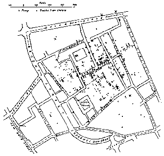
Figure 1.1
The famous dot map of Dr. John Snow plotting the cholera deaths in London in relation to neighborhood water pumps showing convincing evidence that the Broad Street pump was contaminated.
Another interesting example involved efforts in World War II to better armor combat aircraft. One strategy was to plot all the bullet holes on aircraft returning from combat on a crude picture and then add extra armor to other planes everywhere else. The logic was simply that since all the planes probably had been hit uniformly during battle, those that did not return must have been hit in the vital places not marked on the picture (Wainer, 1992).
Given this attention to visual modes of communication, it should not be inferred that other channels are unimportant or should be ignored. In social interactions, speaking and listening are the dominant methods of communication. In computer-enhanced training situations, the expense (in terms of hardware and/or memory) of voice integration -- including both speech output and voice recognition -- has prevented effective integration of aural communication channels in existing software and computer systems. The status of computer speech and voice integration changes almost daily and inevitably will change current notions about how people and computers should interact (see Box 1.1). Even when the language capabilities of computers become as natural as everyday human conversation, visual channels will flourish and remain a dominant influence in the presentation and interaction of ideas in computer environments.
Graphics in Education
The use of graphics in education has a long history. The use of illustrations in books written in English, especially those intended for children, was commonplace by about 1840 (Slythe, 1970). After that time, the use of illustrations in children's books has been especially extensive, elaborate, and artistic (Feaver, 1977). A wide variety of graphics -- from photographs, pictures, and cartoons, to charts, maps, diagrams, and outlines -- is common today in most teaching strategies. The use of graphics in instruction seems to make sense -- it holds a certain degree of face validity. The cliché that a picture is worth a thousand words seems consistent with educational practice. However, research has shown that the relationship between the intent and results of graphics in education is often jumbled (Samuels, 1970).
There is a tendency to use armchair methods of deciding when, where, and how to incorporate graphics in instructional and training strategies and materials. This can lead to unexpected results. Research is just beginning to demonstrate conditions under which static and animated graphics are generally effective, as well as those where graphics serve no purpose or, worse, do harm (Levin, Anglin, & Carney, 1987; Levin & Lesgold, 1978; Rieber, 1990a). For example, consider the cultural symbolism of the owl. Most people from western cultures treat this wise old creature of the forest with affection, although an owl often represents an evil omen for many Native Americans. Classroom teachers should carefully consider the impact of such innocent graphics on all their students. Like most issues in education, graphics represents a qualitative, not quantitative, issue. It is not simply a question of how many graphics are used that determines their effectiveness. The interaction between instruction and learning is complex and does not lend itself to many generalizations. Answers to questions about how best to employ instructional graphics are similarly elusive and evasive.
Instructionally, the role of graphics in computer environments covers a lot of ground. The computer can be used for traditional applications, such as graphics that present static informational images or text that helps someone to understand a concept or principle. Much of the instructional visual research over the past 40 years has pertained to applications such as these. Although most of this research has been in noncomputer contexts, it is still quite relevant. However, the computer offers many more instructional applications than just presentation. One of the most exciting, yet uncharted, areas involves computer microworlds based on computer animation (Rieber, 1992).
|
|
|
Probably the best conceptions of future human/computer interaction come from science fiction. The various Star Trek books, television shows, and movies are among the better examples known to people who are not necessarily "trekkies" and who may not be general lovers of science fiction. In the Star Trek stories, the computer becomes almost completely transparent and completely networked throughout the starship Enterprise and Star Fleet. The more recent Star Trek television series titled Star Trek: The Next Generation has produced some very tantalizing images of how computer technology can help in human problem solving. In this series, the current Enterprise has many improvements and enhancements. Among the most notable is the ability of the computer to produce true holographic, or completely three-dimensional, images. In one episode, Captain Picard is sitting at his desk contemplating a strange planetary system recently visited by the Enterprise. The orbit of one of the planets had a strange "wobble" in it and was unlike anything yet encountered. The captain is shown studying the phenomenon with the help of a three-dimensional holographic model floating peacefully above his desk. The scene shows the captain just sitting at his desk in his "ready room" studying the image with an understandably puzzled look on his face as his first officer, Commander Riker, enters. The importance of representing the planetary system in a three-dimensional model becomes even more evident as the captain gets up and discusses the model with Riker from a different perspective in the room. The 3-D model makes it possible to walk around and see it from every side. It clearly could not be understood very well with text or even with two dimensional graphics (although, of course, that's exactly how it was represented to the television viewer). Only a true three-dimensional "hologram" was able to convey the information well enough for the captain's purposes. The other message given to the television viewer at the end of this scene was that the captain was apparently able to quickly and easily "program" the computer to make this model for him. However, the most amazing application of computer-generated holograms on this new Enterprise is the "holodec" where crew members can go and experience anything from computer-generated California beaches, medieval forests, and snow-covered mountains to smoke-filled nightclub rooms in the past, present, or future. In the holodec the computer can create any three-dimensional environment imaginable, complete with casts of characters. These environments cannot be distinguished from their real-life counterparts. Science fiction to be sure, but this is exactly the dream and goal of developers of cyberspace, also known as "virtual realities." |
Everyday Uses of Graphics and Visual Images
Some of the most stunning examples of graphics that communicate come from outside of education. The popular media -- such as television, newspapers, and magazines -- have long abandoned any real restraint when it comes to using visuals. True, most visuals are used primarily to capture the viewer's or reader's attention for just a few precious seconds. Often, though, the visuals are intended to enhance a memory function by influencing people to remember one product over all others. Consider the many variations of the popular beer commercial that all end in a frustrated "I meant a Bud light!" Pictures go through our minds of all the wrong "lights" that the hapless people seem to uncover. Because they are novel and amusing, the pictures are easily remembered. We automatically associate the pictures with the product name because we have been subjected to countless rehearsals of the two. (See Footnote 3) So, we are likely to remember this one company's product first if we are out shopping for beer. The success of this commercial is a prime example of using pictures as a powerful mnemonic device -- the images and the product name are forever associated or cemented together. You couldn't forget them if you tried. (It also demonstrates the power of applying some simple behavioral principles.)
Some of the best examples of using full-motion video to demonstrate procedural knowledge come from television toy commercials. Advertisers not only must capture the attention and interest of children (no small feat), but show them how to have fun with the toy, albeit in exaggerated and contrived ways. At their best, these commercials unravel the complex nature of a toy in as few as 15 seconds. Particularly good examples are all the varieties of commercials that tout toy robots that transform into cars, planes, and tanks. These commercials demonstrate a tremendous amount of information in a very short amount of time. Although this does not suggest that educators should become advertisers, there is still a great deal to learn from the techniques that successful advertisers use to visually communicate their ideas.
WHY COMPUTER GRAPHICS?
Computer learning environments pose particularly exciting and demanding situations for visual communication. The range and diversity of visualization that computers offer are unprecedented. The last 10 years have demonstrated marked increases in sophistication in the graphics produced and displayed on computers. The success of desktop microcomputer systems integrating graphical user interfaces (GUIs), such as the Macintosh computer, can be largely attributed to the dramatic rethinking of how people should interact with computers. The principal reason to highlight the computer in the design and development of instructional graphics is the computer's increasing range, versatility, and flexibility of graphic design. There is almost no graphic design need that the computer cannot serve. In addition, the design of computer graphics is no longer limited to delivery on computer platforms. The unprecedented spread of desktop publishing is a prime example of the computer as a design and production tool, though the delivery platform is paper.
Many believe the Macintosh computer survived and flourished (unlike its predecessor, the Lisa) because it carved its niche in desktop publishing. (Some suggest it invented it.) Several factors contributed to this. The most important was that the Macintosh effectively combined text and graphics -- the Macintosh was the first popular microcomputer to truly adopt (but not invent a GUI. (See Footnote 4) The marriage of text and graphics was inherent in the Macintosh's operating system as well as in its application software. Up to that time, computer text and graphics existed separately, with great effort needed to merge the two. The other major factor was the advent of laser printers. Fast, camera-ready quality printing, albeit in black and white, suddenly became available at the click of a button. Not only could professionals bypass the time-consuming and expensive step of having their materials professionally typeset, but they could now experiment with alternative designs quickly and easily. In this way, design and development became one process. Ideas could be laid out on the electronic and printed page in a "what you see is what you get" (WYSIWYG) format. Compared with conventional typeset quality publishing methods, the decreased turnaround time for the feedback/revision cycle using computer desktop publishing was staggering. GUI concepts have extended into the area of desktop presentations, where organized presentations are designed and developed by computer, then transferred to delivery platforms such as overhead transparencies, slides, or video.
Both desktop publishing and desktop presentations made the Macintosh computer a business success and offer similar potential to "Mac-like" products (such as Microsoft Windows) because there was an eager market for these innovations. The business world needs to communicate ideas and strategies to clients and consumers in effective and influential ways. Those in the business of education have communication needs that reach much further.
At times, the computer's role looms larger than just economy, efficiency, versatility, or flexibility of production or time. Computer visualization has become an important problem-solving tool for people. Probably the best example of this collaboration between people and computers is the relatively new science of Chaos (see Box 1.2). The computational power of computers has permitted people access to ideas that previously were off-limits because of the tremendous calculation demands. Instructionally speaking, the number of creative strategies and applications that simply would not be possible or practical without computer technology is increasing. Most cases in point involve computer animation.
Certainly, the use and history of animation in film easily predates modern computer technology. Many media, such as film and video, can present animated sequences. However, the computer is rapidly becoming an important tool in modern animation studios, including Disney. The field of visualization uses computer animation as a central tool for studying problems and issues in architecture, medicine, and fine arts. In each of these cases, the computer is used as an important production tool for creating animation sequences that are normally transferred to film or video for delivery. Rarely do these areas need or use the computer for delivery. In many cases, due to the complexity of the production, the computer might take up to 30 minutes to create each individual frame of the animation, shutting out the possibility of real-time animation. However, many tasks that can be animated in real-time present exciting possibilities in education.
|
|
|
Computers are often viewed as the epitome of a mechanized, inhuman world. People often express fear that computers will create an "Orwellian" world in which personal freedom and expression will be eliminated. However, a contrasting view perceives computers as our liberator by performing the many tedious tasks heretofore done by humans, thereby allowing people to more fully realize their growth potential. This idea is simply to let machines and people do what they do best. Nowhere is this more striking than in the science of Chaos (Gleick, 1987). Chaos, as the name implies, is a new science that explores events that are seemingly erratic, random, and haphazard. However, this science has begun to understand that many phenomena that seem to be random events on the surface may actually have a hidden order lurking below. Perhaps the most intriguing aspect of the science of Chaos is that these phenomena do not simply occur at the molecular or atomic level, but at the everyday level as well. Examples of chaotic phenomena are the turbulent patterns in mountain streams, ribbons of smoke from a cigarette, flags waving in the breeze, and the dripping of a leaky faucet. More accurately, Chaos is a study of nonlinear systems. We are all familiar with linear systems where one variable changes predictably to changes of another variable, such as the relationship between acceleration and velocity. However, nonlinear systems are far more complex. Solving problems in nonlinear systems has usually been tried with linear models. Since the fifteenth or sixteenth century the goal of science has been to fully understand the laws that govern the universe. It was believed that the problem was not that we were incapable of understanding, just that we were not able to collect enough information to complete our mathematical models. This was the idea behind Newton's "clockwork" universe. A good example of this is weather forecasting. The hope has always been that if enough data were collected at enough locations worldwide, we would be able to predict the weather with reasonable accuracy days, weeks, or even months into the future. Obviously, one can not collect all the data available, so as much information at as many geographic points as possible is sampled. The goal has been, for example, to create an elaborate linear model involving hundreds of components such as the noon temperature in Paris, the monthly precipitation of Florida, the humidity of Moscow, etc. The hope was that if enough information was collected, we might finally be able to accurately predict the weather tomorrow in New York City. Unfortunately, weather patterns are nonlinear systems, and Ed Lorenz, a research meteorologist at the Massachusetts Institute of Technology, discovered that the use of linear models to help solve problems in nonlinear systems is little more than wishful thinking. In 1960, Lorenz constructed a model of a weather system on his computer. Of course, the measurements he entered into his computer could never be perfect but only approximations. He discovered that the smallest errors, even those resulting from rounding to the nth decimal, would create vastly different outcomes in his "toy" weather system. This phenomenon became known affectionately as the "butterfly effect," based on the idea that even the stirring of a butterfly's wings in Peking can be the difference between a sunny or stormy day a month later in New York. The notion of long-range weather forecasting based on linear models was doomed. The general principle learned was that even the smallest differences in input would cause tremendous differences in output when a linear model was used to study a nonlinear problem. So what is the connection to computer graphics? Many of the hidden patterns and elements in the raw data of nonlinear systems start to become evident when they are represented graphically. Because people are generally good at pattern recognition, researchers in Chaos theory frequently have the computer construct pictures from the data. A good example of this is fractal geometry, where a particular shape is repeated infinitely within itself. The mathematician Benoit Mandelbrot is generally given credit as the originator of formal fractal geometry. A clever way of experiencing this partnership between computer visualization and human problem solving is called the "Chaos Game," devised by Michael Barnsley, a mathematician at the Georgia Institute of Technology. There are many varieties of the Chaos Game, but the following example draws a figure commonly known as the Sierpinski Gasket. To play the game, you need the following materials: (a) a sheet of paper; (b) a pencil; (c) a ruler; and (d) a game die. Here are the game rules:
What would you expect to get when you are through? Most unsuspecting people expect a random arrangement of dots that either fill the paper or the area within the three game points. Instead, what is produced is a chaotic system, in the sense that what appears to be random and unorganized at first glance can contain an amazingly complex and ordered pattern. Of course, most people are not willing to invest the time or energy to play the game carefully for the thousands of trials necessary to see the result. So, let's let the computer do the part we hate -- number crunching -- and we will do the part we are good at -- interpretation. The following program, written in HyperCard's HyperTalk on the Macintosh, plays the game for us for as long as we care to let it run:
The program produces something quite unexpected. Turn to Figure 1.5 to see the result. |
Real-time animation occurs when the computer is able to display graphic frames in a quick enough succession to produce the illusion of motion. Real-time animation permits computer applications such as video games and simulations. We are all familiar with the idea of a flight simulator, where the screen display changes depending on whether we are pushing the plane's control stick forward to dive toward the ground or pulling back to climb higher into the sky (either by pressing certain keys or moving a joystick or mouse). Simulations, both of real and imaginary things (like most dungeons-and-dragons-style video games), represent microworlds of realities or fantasies where a user goes to experience something firsthand. For example, real-time computer animation can make a simulated journey into space become a real experience. Here students might learn for themselves what it would feel like not to be bounded by gravity or friction.
By combining technologies, the illusion of leaving the real world and stepping into another computer-generated one can be multiplied many times over. Virtual realities can be created by fitting a person with headsets mounted with video screens. The individual also wears a special data glove that sends commands (like forward, back, and stop) to a computer via hand signals. This results in a convincing illusion, such as moving about on an uncharted planet or strolling through the lobby of a proposed skyscraper. Even though current technology can only produce crude graphics for these imaginary trips, the illusion remains strong because the headset does not allow any competing visual stimuli to enter the person's field of vision. (This is discussed further in chapter 8.)
Advancements in the Production of Computer Graphics
Computer hardware and software manufacturers appear dedicated to the idea that computer displays and resulting human interactions should be graphically based. The ability to produce and integrate graphics into instructional courseware should become easier as systems become more visually oriented. This, of course, poses the ironic problem of what to do with this graphical computer power. Instructional designers face tough challenges. Too many choices create the temptation to design instruction with as many features special to the computer as possible, often in the attempt to justify the use of the computer as a design and delivery system. It seems that this temptation is becoming harder to resist as systems that afford even greater graphical power at reduced development costs become available.
The trend of GUIs in many microcomputers has led to increased availability of graphics for CBI authors. Today, the compatibility of object-oriented software applications on GUI systems permits the almost-casual availability of graphics in CBI development. Textual and graphic objects can be shared among applications via concepts such as cutting and pasting, clipboards, and scrapbooks. Users can quickly create firsthand graphics and then import or paste these into CBI lessons. Commercially produced graphics -- electronic clip art -- provide designers with a ready supply of second-hand graphics. Beyond all these are video digitizers and optical scanners that permit real objects and print-based graphics, respectively, to be digitized and imported into courseware (copyrights notwithstanding). The quality of scanners continues to rise as the cost continues to fall. Although scanning and video capture technologies are still far from perfect, they are sure to be, by far, among the most flexible and cost-effective approaches to graphic design.
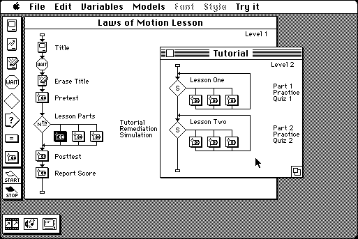
Figure 1.2
CBI authoring approaches are shifting from traditional command line environments (above) to ones that employ graphical elements (below).
More and more authoring approaches are also using graphics to aid the design process itself. Figure 1.2 compares a traditional "command" authoring environment with an object-oriented one. (See Footnote 5) Lessons are designed and developed by manipulating a variety of icons, each representing a particular instructional function, on flowchart-like displays.
Advances in computer animation production are particularly poignant examples of how far computer technology has come in such a short time. Traditional programming approaches to animation are tedious and labor-intensive. Real-time animation of even a modestly complex object used to require advanced programming knowledge. Improvements in producing computer animation have occurred steadily. For example, the advent of high-level programming languages, such as BASIC or PILOT, removed the need for hobbyists to learn an assembler language or machine code to create convincing animated displays. Still, nonprogrammers had to master shape tables and programming commands based on abstract mathematical coordinate systems.
GUI systems make the mathematical processing of animation almost completely transparent. Many systems offer advanced features, such as the ability to interpolate an animated path between a set of given end points. These systems also offer authoring advances in data-driven animation, which is the animation of objects based on constantly changing program values, such as student input. Data-driven animation is at the heart of visually based computer simulations, such as flight simulators. Animation has become a very popular feature in CBI applications, although, just like other graphics, the instructional goal that animated visuals serve is often not clearly defined.
QUESTIONING THE MOTIVE TO USE GRAPHICS IN INSTRUCTION
The use of graphics is particularly strong in training environments and situations that emphasize materials-centered instruction, of which CBI is an example. Materials-centered instructional environments depend on media other than the teacher, trainer, or workshop leader for the primary presentation of instruction. Apart from computer applications, materials-centered instruction has been a dominant influence in instruction and training since World War II, especially in the private sector and in the military (Reiser, 1987). Traditional examples of media include textual materials (books, workbooks, worksheets), videos and films, slides and filmstrips, learning centers, and overhead transparencies, to name just a few. The field of educational technology is usually associated with its contributions in refining design techniques used to produce materials-centered instruction. This field has witnessed a healthy resurgence as the era of microcomputers has matured. Most educators need to be reminded that one of the earliest examples of materials-centered instruction -- the book -- also remains among the earliest forms of distance learning. The ability to document the knowledge base of an expert (or group of experts) and then replicate and distribute this source of information to others cheaply and efficiently remains the hallmark of Gutenberg's invention.
Replication remains the principal appeal of materials-centered instruction. Cheap and efficient replication means that even big investments of instructional design and development efforts can be economically productive. The outlays of this investment are work and knowledge (Bunderson & Inouye, 1987). The computer epitomizes easy replication because once courseware is developed, the cost of duplicating the effort by copying disks is almost trivial. Each duplicated disk represents the total replication of perhaps years of work and knowledge. This inexpensive disk can then be shared commercially (or otherwise) with instructional consumers' such as teachers, trainers, and students. No distance is too great between the developer and the consumer so long as the consumer has the means and resources to use the product. In all likelihood, graphics will continue to be found throughout replicated computer courseware. The question begging to be asked, then, is, what is it we are replicating, exactly? In every case, the answer has two parts -- a product and a process. Both need to be evaluated carefully. Let's examine the product first.
The instructional design of a given medium is biased to delivering only certain instructional attributes or stimuli. Audiocassettes deliver aural stimuli, such as the spoken word, music, and other sounds, generally in a predetermined order. Overheads can present only static visuals, such as words and pictures. Other media offer mixtures of attributes. Slide/tape projectors can offer static visuals and sound. Video (and film) can offer static and dynamic visuals and sound. Computers offer the delivery of static and dynamic visuals (animation) in linear and nonlinear formats with high-quality sound becoming increasingly available. Link the computer to other media, such as videodisc players, and you have examples of multimedia in which the number of instructional attributes is almost unlimited.
Of course, computers do a poor job of delivering attributes unique to the human medium, also known as the teacher. Anticipating a wide range of responses, especially voice inputs, always has been a stumbling block for CBI design. In addition, computers can't react to a student's puzzled or frustrated look, and computers cannot determine the right kind of encouragement to offer when a student's self-esteem needs a boost.
Each medium demands a unique set of production skills that usually emphasize special attributes of that medium. Most developers find particular delight in producing packages that highlight a medium's attributes.
The history of filmmaking is a good example of how production characteristics of a medium mature over time (Papert, 1980). Early filmmakers began by mimicking what was then status quo: a camera, placed on a pedestal, photographed a play acted out on a stage. It is remarkable how far the medium has come during this century, considering all the production effects that are now part of standard filmmaking: zooming, panning, lighting effects, color, flashbacks, and so on. The next time you watch a movie or television show, do this simple test of the sophistication of its production: count the number of different camera angles and the duration of each. Most viewers are surprised to learn that five seconds rarely pass before the angle changes. Transparency is a hallmark design characteristic of most media. Well-produced film and video productions make it easy for us to become personally involved in the story or drama, and less likely to remember that the actors are really just performing in front of a large production crew. Transparency also means that a person's attention can be devoted to the message and not distracted by the medium -- an especially important notion for instruction.
The point is that production skills are always biased to the attributes particular to each medium. If we evaluate only the product side of instructional media, then we are judging quality only on the basis of production. It is easy to forget that there is also a process that is being replicated. This is unfortunate, because the process should determine the product. In instructional media applications, this process is called instructional design. As certain instructional media, such as the computer, increase in popularity, the importance of "putting the horse in front of the cart" also increases. Guiding the design of graphics in educational computing is especially important as the graphical power of computers increases. The temptation to incorporate a wide array of graphics, simply given the awesome ability to do so, can be overwhelming. Guidance is needed to ensure that instructional processes direct instructional product development.
INSTRUCTIONAL DESIGN VERSUS TECHNOCENTRIC DESIGN
Designing instruction is a formidable task. The development and refinement of instructional design has been slow, but continual (see Reigeluth, 1983a, for a review). There are essentially three approaches: empirical, artistic, and analytic.
The first is called an empirical approach because it is based largely on trial and error. You begin with your best idea, try it out, carefully observe what works and what doesn't, and then make adjustments for the next attempt. In instruction, this translates into a system in which very rough products are field-tested with students. Usually, the starting point of this system is just one's best guess, with little or no supporting rationale. The chances of success for the first few attempts are slight. During each trial, the designer tries to observe key points at which failures occur. Because a pure empirical approach does not use any particular model to guide the design effort, few improvements come from any one trial. However, the design is slowly and progressively shaped to achieve the desired goal. This iterative process is often the strategy used by content experts given teaching or training responsibilities for the first time (such as new university professors in the hard sciences, and, to a lesser extent, beginning public school teachers).
With the second approach, called here artistic design, the tendency is to look at instruction as an art or craft that takes years to hone and perfect. From this perspective, each instructional design project is like a painter's latest masterpiece. Similarly, teachers often begin to build up a repertoire of teaching strategies and ideas based on years of experience. A master teacher is seen as someone who is somehow able to go into a room all alone and emerge with an instructional plan that everyone trusts. These people may be excellent models and perhaps good mentors to novices but are largely unable to explain what precisely they do or how they do it.
The empirical and artistic approaches are quite inappropriate in the design of materials-centered instruction. Pure empirical approaches based on a large number of trials are expensive and waste time, and the likelihood of finding a good ready supply of instructional artists is very slim.
This leads to the third approach, here called the analytic approach. An analytic approach uses a systematic and systemic plan to guide the decision-making process of instructional design. (See Footnote 6) The analytic approach is best known as the systems approach to instructional design, on which scores of models are based (see Andrews & Goodson, 1980, and Gustafson & Powell, 1991, for examples and reviews). The analytic approach tries to keep all the variables in the design process properly balanced and views each in the overall context and perspective of the task at hand. The analytic approach also incorporates the empirical and artistic, but controls for their weaknesses and potential excesses. The methods of the analytic approach are analogous to the direction provided by an orchestra's conductor. Without proper guidance and control, many musicians soon would be competing for recognition and control of the musical score. The conductor ensures that one interpretation of the selection is followed but allows the artistry of each member to contribute to the overall effort. Other analogies liken an analytic approach to the recipe of a master chef, a road map on a cross-country trip, or the blueprint for the construction of a house (Reigeluth, 1983b). However, the cab driver's advice to the lost violinist that the best way to get to Carnegie Hall is to "practice, practice, practice" is still sound. The analytic approach, through the processes of formative evaluation or rapid prototyping, also takes the position that only so much can be anticipated. Regular and systematic field testing of the materials is an integral part of the analytic approach.
There are scores of instructional design models based on the analytic approach. An example of a model meant for CBI design is shown in Figure 1.3 (adapted from Burke, 1982). However, the application of these models is frequently prone to many pitfalls and misconceptions, even by seasoned and well-intentioned instructional design veterans. The most deadly is the tendency to overmechanize the process by believing that successful instruction will result so long as each step (procedure, or flow chart box, and so on) is followed. The other tendency is to ignore the potentially important contributions of the empirical and artistic approaches. Creativity and innovation should not be considered to be inconsistent with an analytic approach, nor should an analytic approach become too far removed from the classroom or other training environments.
Another common pitfall is the tendency to put on design "blinders" and ignore everything but a predetermined goal. This pitfall likens learning to a conveyor belt on which the student inches slowly toward mastery of a handful of objectives. No attention is given to other healthy pursuits that may occur en route, nor is the student given any credit or responsibility to take on other explorations than those charted by the designer. This pitfall is largely an artifact of the dominant behavioral influence in the history of instructional design. This perspective tends to describe learning as just a consequence of being there. This approach can work well when the learning goals are narrowly defined, such as fact learning, but it does not hold up as well when goals lean more toward problem solving (Clark, 1984a). The contrast to this is instructional design based on a cognitive approach, which, simply stated, looks at design from the learner's point of view (Case & Bereiter, 1984).
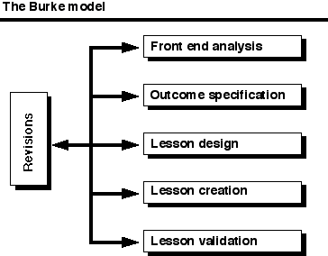
Figure 1.3
An example of an instructional design model applicable to CBI.
At least one other approach competes with instructional design. This approach goes in a completely different direction and is very prevalent in materials-centered instruction across all media, including computers. It is also very contagious and seems so right to instructional designers who are confronted with tough design decisions. This approach does not put the learner at the center of the process; neither does it actually put instruction at the center. This approach, which we will call "technocentric" design" (Papert, 1987), lets the technology dictate decision making, as summarized in Figure 1.4. (Usually, technology is equated with the products of instruction, such as computers, overheads, and videocassette recorders. Try to remember that technology can refer to products and processes.) The misuse of graphics has been especially prone to this approach. As the word technocentric suggests, a certain technology is put at the center of the process and all subsequent design decisions are based on their relationship to that technology. At first glance, it is hard to find fault with this approach. But there are many dangers inherent in this approach. For example, the decision to include high-resolution graphics, color, pull-down menus, etc., is largely based on whether or not the computer has the particular capability rather than if the feature is really necessary for learning. Often, designers and consumers of educational computing unconsciously fall into technocentric traps. We might call them "technoromantics" because they are honestly infatuated with their machines and believe that good instruction always incorporates all of their machine's capabilities (Ragan, 1989).
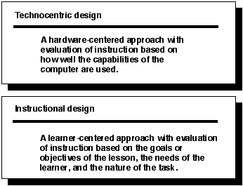
Figure 1.4
Instructional design versus "technocentric" design.
A technocentric designer would criticize CBI, for example, that contains no graphics or animation. A technocentric attitude encourages the use of all special features, instead of questioning whether such features are relevant to the lesson goals or distract a learner's attention. Technocentric designers ask questions like "Can it be done on the computer?" instead of questions like "Who are the learners?" and "What are my instructional goals?"
Obviously, the premise taken here is that one must be very careful not to take a technocentric view in designing instruction. Unfortunately, many people who design CBI for a living tend to think first about the computer, not the learner, when they start a new project. As they build their instruction, every aspect of the design is related to the computer. Instructional design, by contrast, puts final media selection at the end of the design phase and right before final development (Gagné, Briggs, & Wager, 1992). The starting points are always the learner and the instructional objectives. These lead to the design of instructional strategies and, in turn, to the selection of the most appropriate instructional medium (or media) to deliver the instruction.
Media decisions should not be made until other instructional decisions have been made. For example, you may decide for one reason or another that real motion is important in communicating the idea or that demonstration is necessary in order to model a certain procedure. After instructional strategies and tasks are determined, you can then look to media that offer appropriate attributes to deliver them to the student. At first you consider only the ideal alternatives, but soon the decision-making process must also include compromises, which may lead you away from the ideal media to ones that are available or practical. Instructional design with graphics involves many considerations beyond the instructional ones. Economic considerations can override good design intentions. Constraints to the eventual installation of a program also affect media decisions. For example, you may be able to develop a course on computer, but not be able to adequately deliver it by computer given lack of hardware for large numbers of students. Instructional design makes you weigh all these issues carefully at all levels. This book's approach to design follows an analytic approach that is flexible enough to take advantage of the strengths of the empirical and artistic approaches.
REVIEW
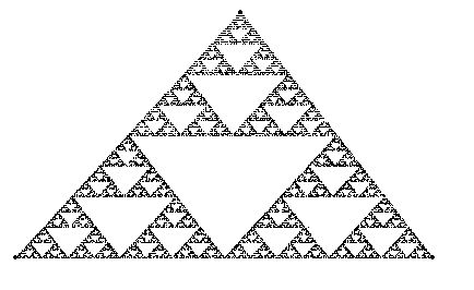
Figure 1.5
Here is the result of Box 1.2 -- the Sierpinski Gasket. The pattern repeats itself to infinity.